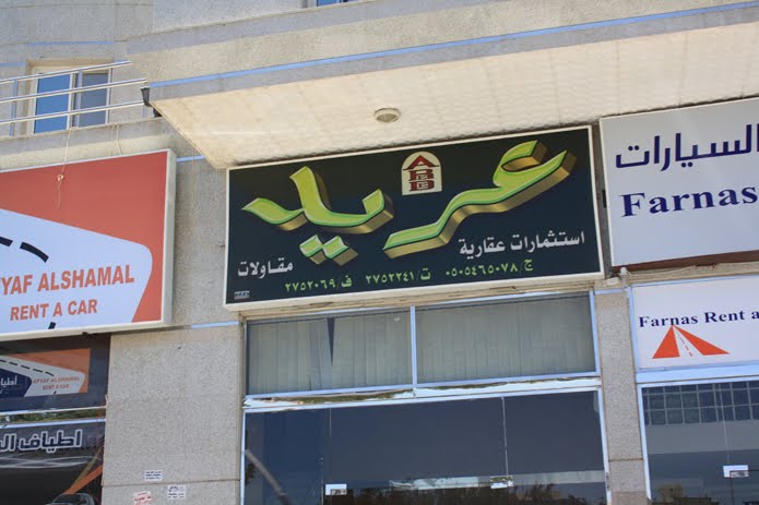

Kitsch is considered pejorative and lacking aesthetic values but to me Kitschy Jeddah is humorous and joyful. The lens flare is a must when it comes to hairdressers’ and laundry shop signs, not to mention the electrical appliances shop signs. Flat vector type or illustrations are out of the question. “Drop shadow, emboss, outline stroke, inner glow and you’re ready to go.” Naskh and Kufi are the dominant scripts while a multitude of curly display fonts are used. Yellow and Red are the Saudi colors par excellence. The colors are vibrant, tones are loud, sizes are exaggerated. The fact that Jeddah is a very big city influences the size of any outdoor sign, ad or even sculpture. Moving from Beirut to Jeddah I immediately felt the significant difference in size of roundabouts, outdoor media, shops, malls and of course streets. The following pictures are taken in the older areas of the city that are among the crowded and rather industrial areas. Basically these are the areas that have a certain visual identity however poorly designed it is. Theoretically, this portrays the actual taste of the locals and their way of using nowadays technology. But you can’t but ask yourself, “ Who designed these signs?” Aren't they the Asian visualizers who form the majority of labour force in Saudi Arabia? And if so, to which extent these signs represent them rather than the local Saudis?